Platform Financial Advisor — the whole picture, down to the receipt
A financial health platform that shows where the money actually goes, lets you follow any figure down to the transaction behind it, and projects where the trend lands.
Most financial dashboards answer "what happened" and stop. They cannot tell you whether the number is trustworthy, what is driving it, or where it lands if nothing changes.
One place for the whole position — worth, cash flow, commitments, trend — with every headline figure openable down to the transactions underneath it, and a forecast attached to each one.
Eight years of history in a single trend, 7,000 transactions searchable in one field, and projections that state their assumptions. Where the data is incomplete, the screen says so instead of guessing.
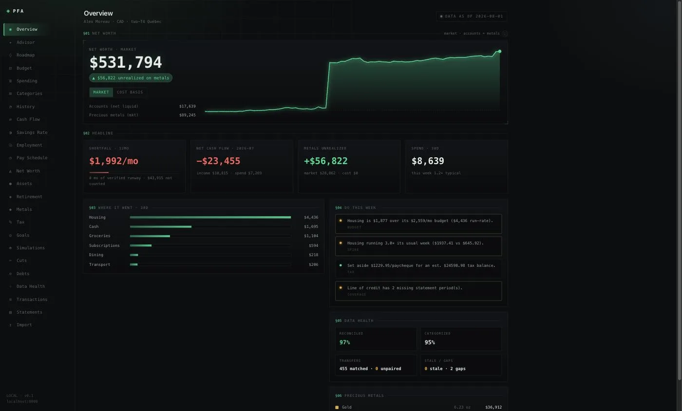
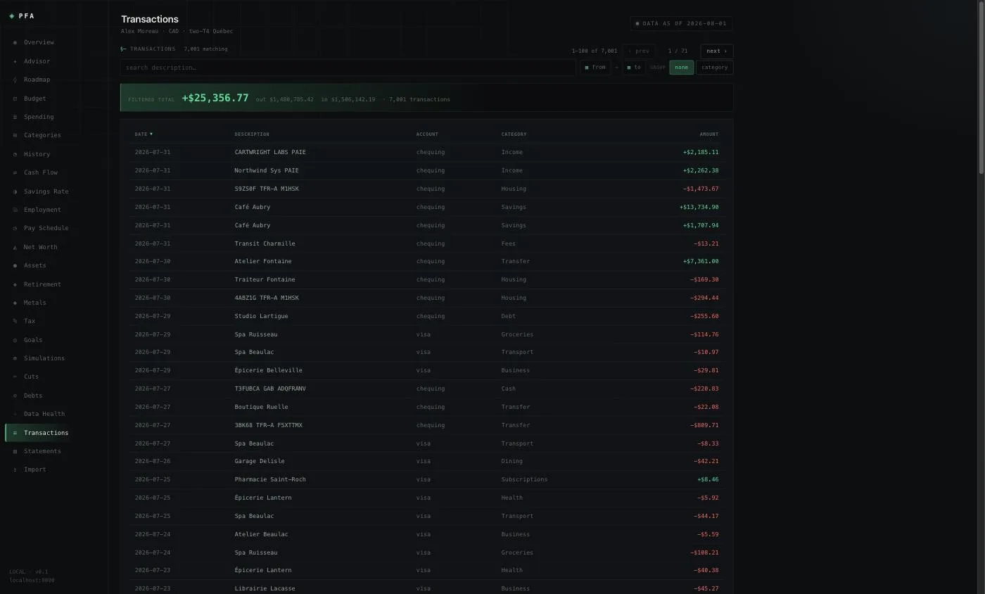
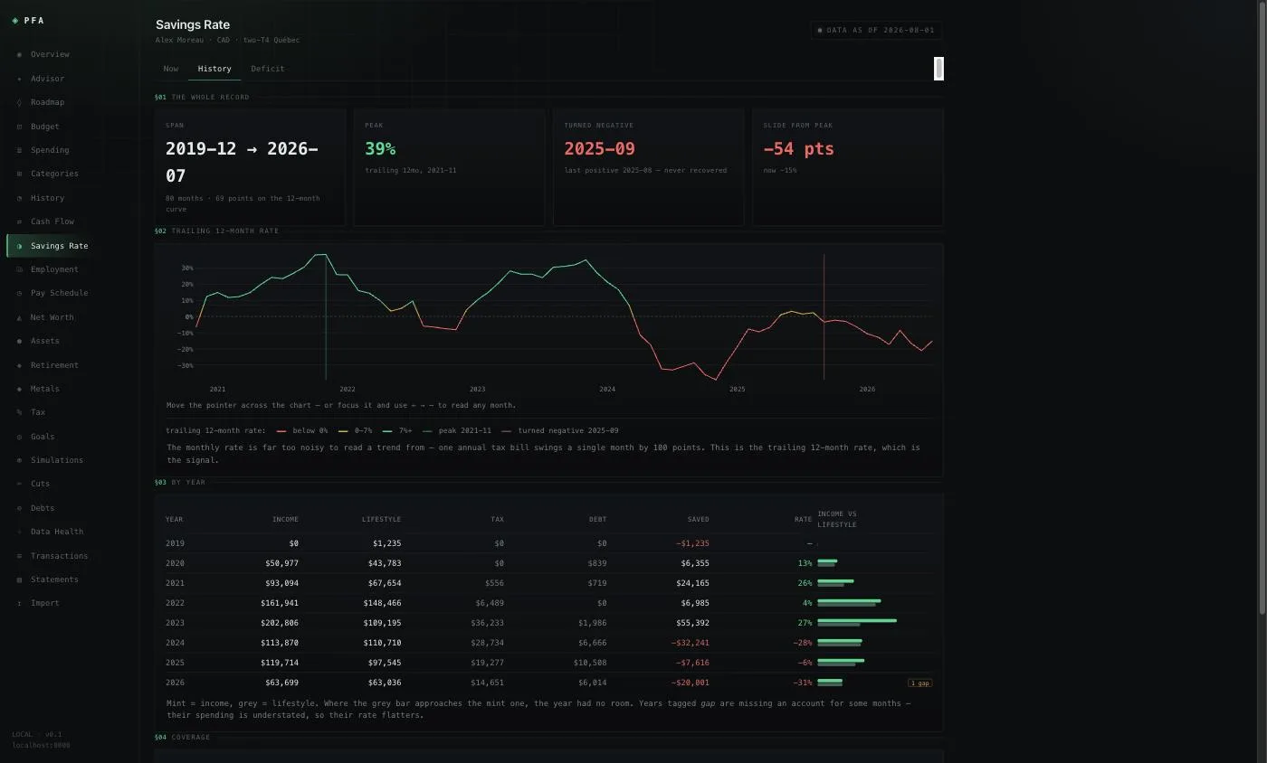
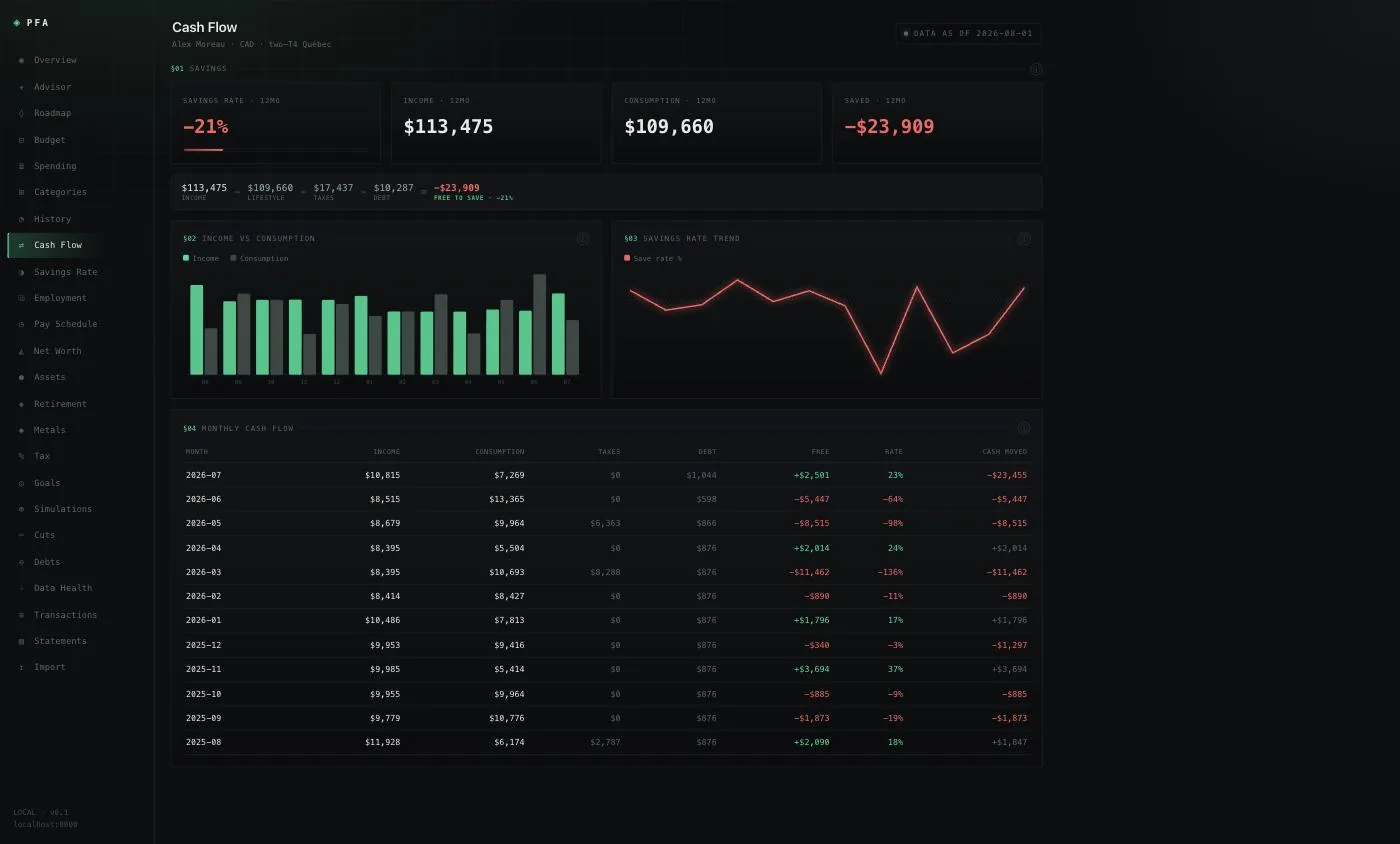
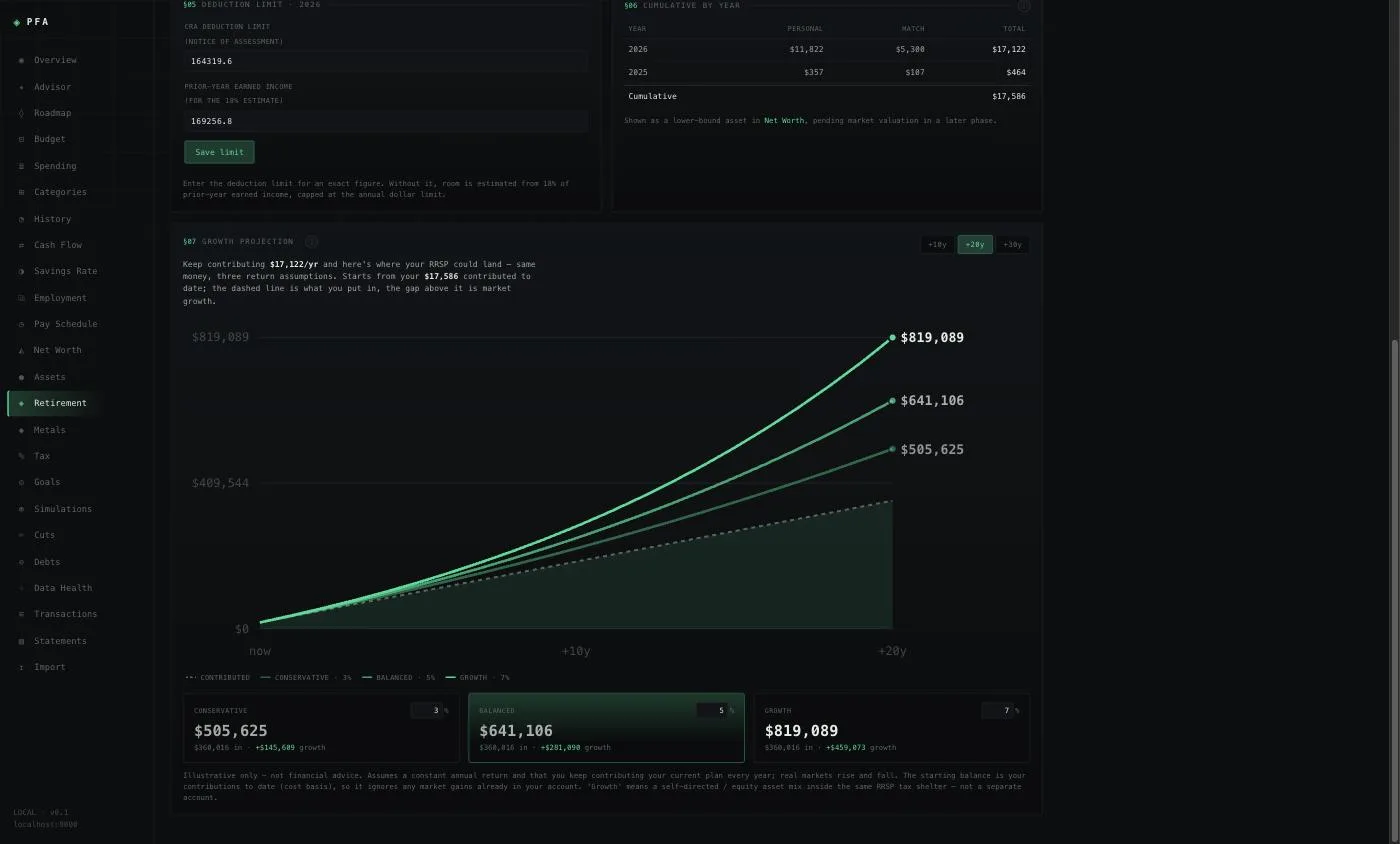
Screens use a demonstration dataset — real structure and real eight-year shape, with names and figures replaced.
Three questions, one place
Most reporting answers the first question only.
Where am I? Net worth, cash position, what is committed versus what is actually free. Not four exports reconciled by hand on a Friday.
Why? Every headline number opens. A category that looks high becomes the merchants inside it, then the individual transactions, with the running total for whatever you have narrowed to. No figure on any screen is a dead end.
Where does this land? Trends across years rather than a month against last month, and forecasts that carry their assumptions on screen — because a projection whose assumptions are hidden is a guess with a chart around it.
The part that matters
A dashboard is easy to build and easy to trust too much.
This one was built after its own headline figure turned out to be wrong — not by a rounding error, but by a wide margin, for months, while every screen agreed with every other screen. Money that had genuinely left was filed as an internal movement and quietly excluded. The arithmetic was correct throughout. The category was wrong, and nothing in the system was capable of noticing.
So the platform is built to argue with itself:
- Every dollar has to land somewhere. Outflow is reconciled against the headline figures, and anything excluded has to carry a stated reason. If the two do not agree, that is reported rather than absorbed.
- A target and a description are not the same thing. A budget you decided on and an average of what you happened to spend look identical on a chart. Shown as the same thing, a page of green rows can sit on top of a failing month, so they are never drawn alike.
- Incomplete data is stated, not smoothed. Where transactions are pending or an account has not been updated, the screen reports what it cannot see rather than reading a quiet month as a good one.
What that changes
You get a number you can act on rather than one you have to sanity-check first, and when the platform is not sure, it tells you — which is the only way the rest of it is worth anything.
Useful when the finances have outgrown a spreadsheet but not yet earned a finance team: several accounts, income that arrives irregularly, tax to set aside before it is owed, and decisions that need a straight answer this week rather than at year end.